How does one choose an image for an ethnographic monograph? And how did this one come to be?
The cover for Access Vernaculars features a painting by artist Andrei Roiter, with text design by Cornell University Press. This is the second time I’ve used an image by Roiter for a book cover. The theatre chairs that appear on the cover of my first book are also from one his works.
For the cover of Access Vernaculars, I spent quite a bit of time searching contemporary artworks by artists originally from Russia and Ukraine. Several works of photography and painting were in the list I sent to the production team at Cornell University Press. One option was the image that appears as an illustration of the “second kind of inaccess story” in the Access Vernaculars Introduction. However, ultimately, I worried that this image, a photo of a person in a wheelchair on a ledge high above the ground, might be misread without the context explaining that it is an intentionally ironic contemporary artwork intended to circulate on social media.
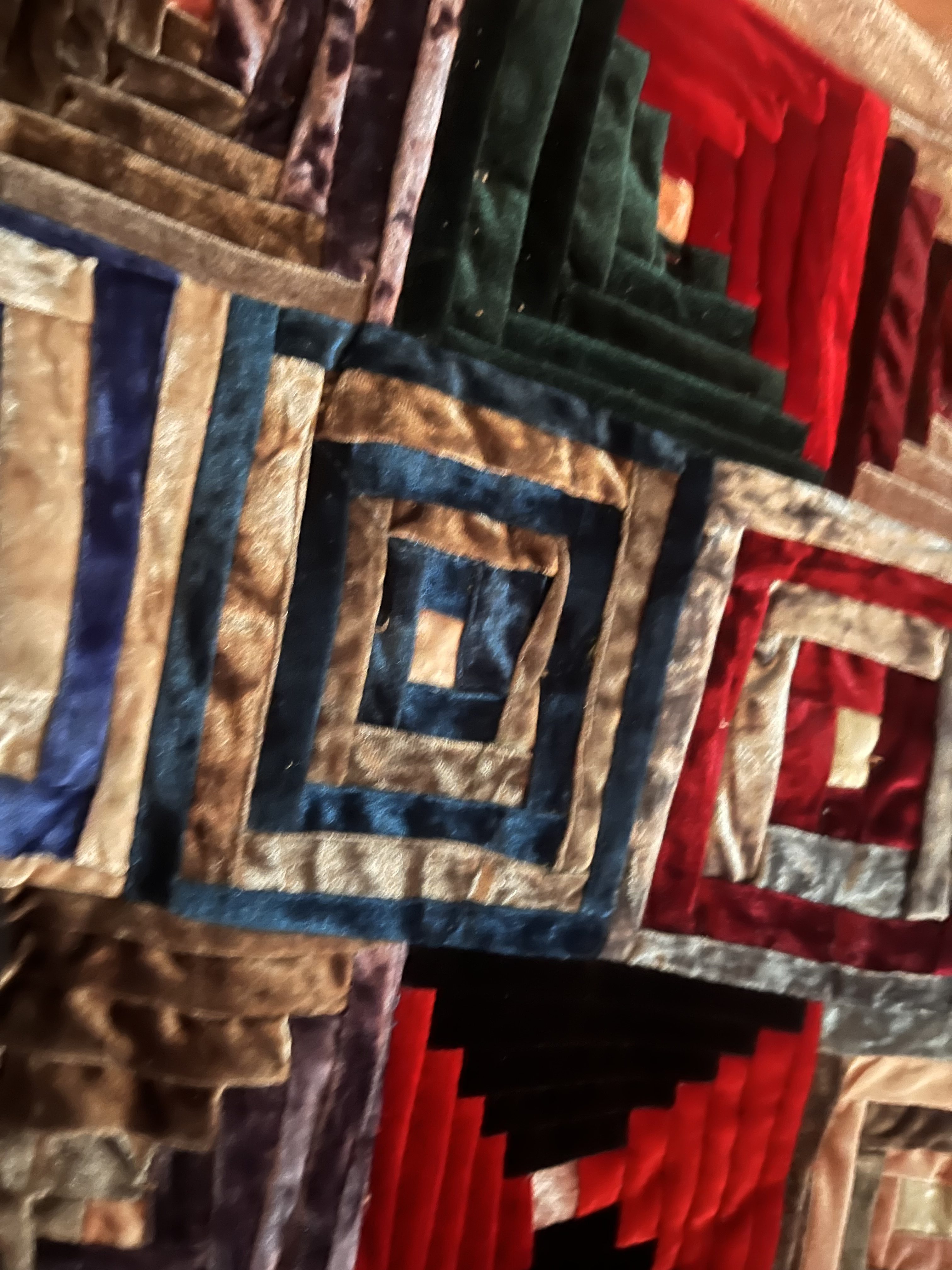
Roiter’s image of a rolling red ramp on a dark green background stuck out to me and my editor for its combination of semi-abstract elements that make for a compelling cover, and it’s thematic conceptual link in the form of a ramp unusable for wheelchair access.
Interestingly, while Roiter’s archive does include paintings of several “disability things” (to use Ott’s turn of phrase), the image that we chose for the book cover is not specifically linked to disability.
Titled “The Red Waves” (1998, oil on canvas, 50x70cm), this piece depicts a ramp that rises, then falls, then rises again, in a series of waves, with little contextual information to place the purpose of such a design, a decontextualization which has the result of suggesting a kind of absurdity, even as the confident, painterly strokes leave no doubt as to what is depicted. In the background, text hovers over the sky of the implied painted landscape. Rendered in brushstrokes in a hue similar to the dark greenish-blue ground, Cyrillic text reads «формы знаков на моё пути из дома». The text might be translated as “forms of signs on the path from my house,” a phrase that resonated with the poignant observation from my interlocutor, Anya, a powerchair user, who quipped, “I don’t need a ramp at the pharmacy if I can’t get out of my house!”

Of course, I knew that my own interpretation was distinct from Roiter’s original intention. When I wrote to his studio to inquire about usage rights, his assistant shared that The Red Waves is one of the few of his works that Roiter keeps hanging in his own home. He was kind enough to reply to my inquiry about the origin of the image.
The image comes from a snapshot I took of a minigolf course in a park. This painting is an example of my regular practice of defamiliarizing a banal site (or object) in order to see it as an abstract form. This allows me to see potential for other readings and poetic messages. For this piece, “The Red Waves” I associated the form with the dynamics of Russian history, with its high and low points.
– Andrei Roiter, personal communication, July 18, 2025
Reading Roiter’s email, I immediately recognized the rolling red ramp as part of a minigolf course, and appreciated, as he mentioned, the poetry that emerged through defamiliarizing the designed object.
His practice of defamiliarizing speaks to me as an anthropologist invested in the work of making the making the strange familiar and the familiar strange. Perhaps this elemental similarity between his painting practice and ethnography (as well as an affinity for gestural oil paintings) is part of what draws me to Roiter’s work. I’m very glad to feature this one of his images as part of the design of the Access Vernaculars cover.